Client /Cuidando
Type of project /Branding
Date /2020
THE PROJECT
THE CHALLENGE
MY ROLE
Cuidando was facing a huge change in its organization: they started in 2016 with only one service stream in the eldercare industry, and four years after they had added 4 more services to their porfolio.
After this both its name and its logo were outdated. Additionally, they had the vision of working each service as an independent brand while maintaining a global brand encompassing all of them.
Visual Designer in charge of the complete process: moodboard & inspiration, concepts and value of the company, creation of the brand and sub-brands.

the process.-
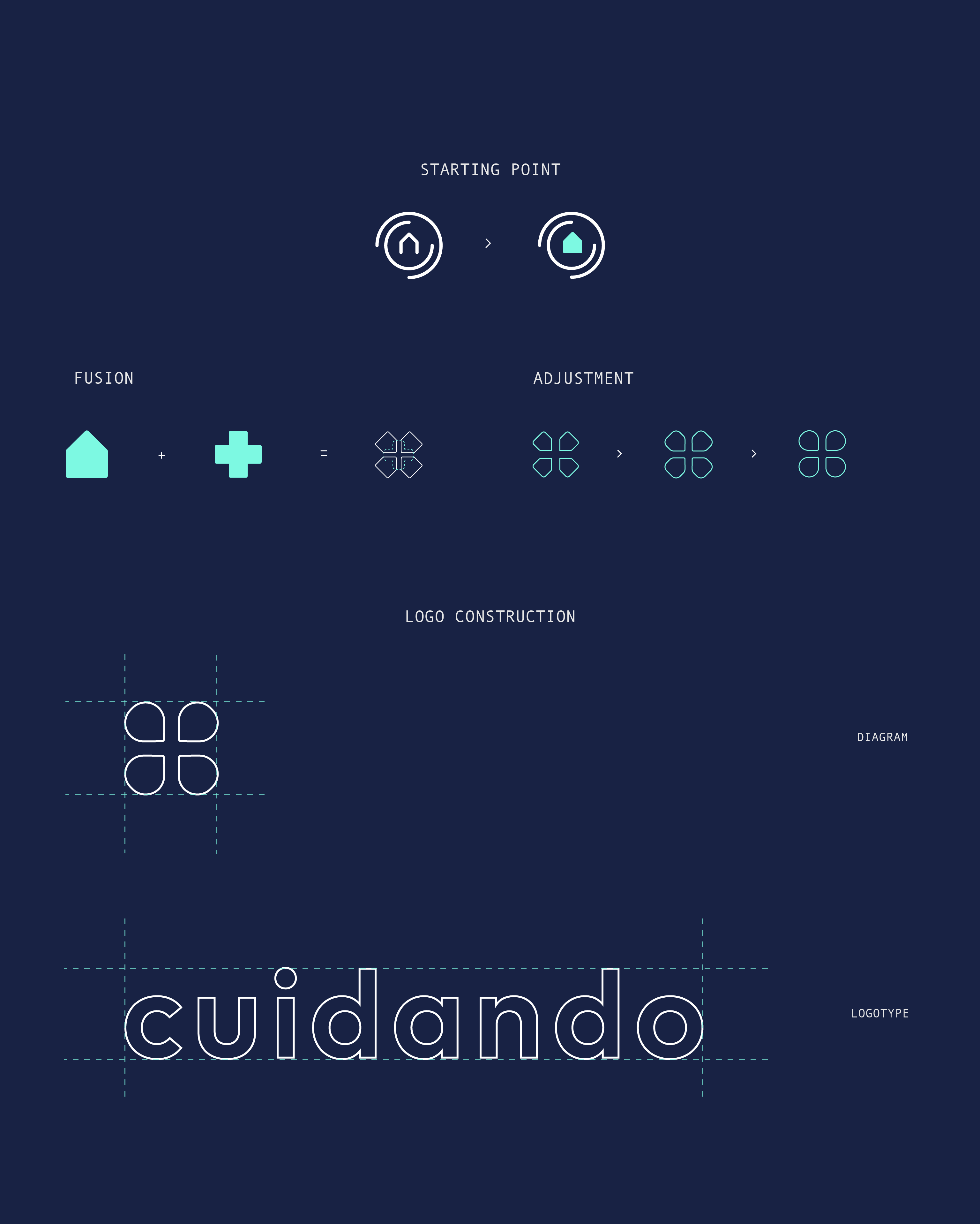
The new logo was created by merging two important elements: the old house (to recall the original referent) plus a medical cross (to reinforce the idea of heath care).
sub brands.-
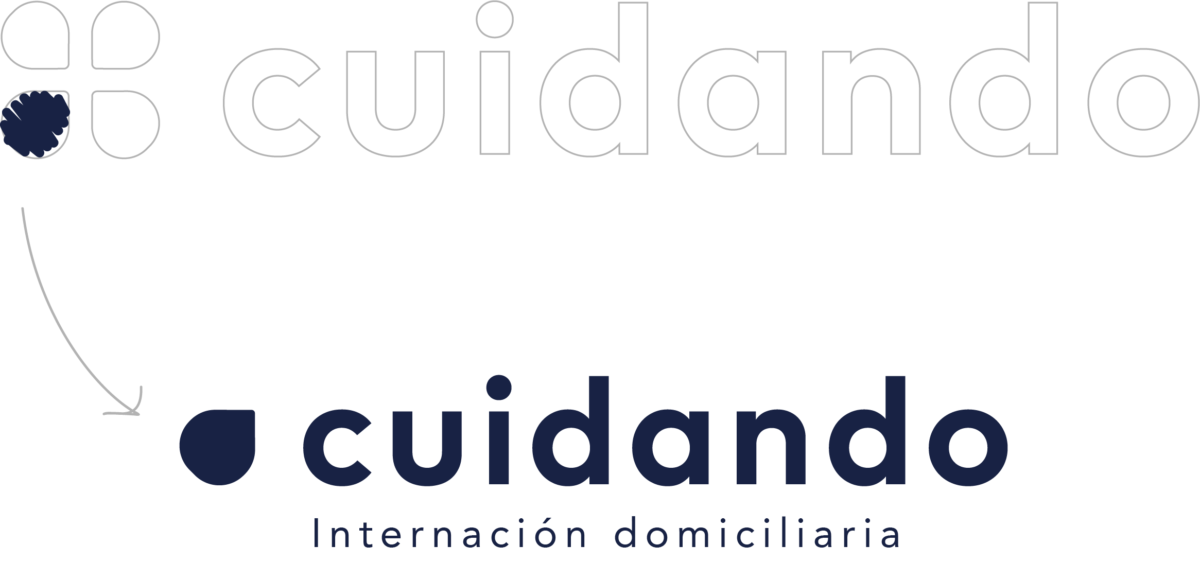
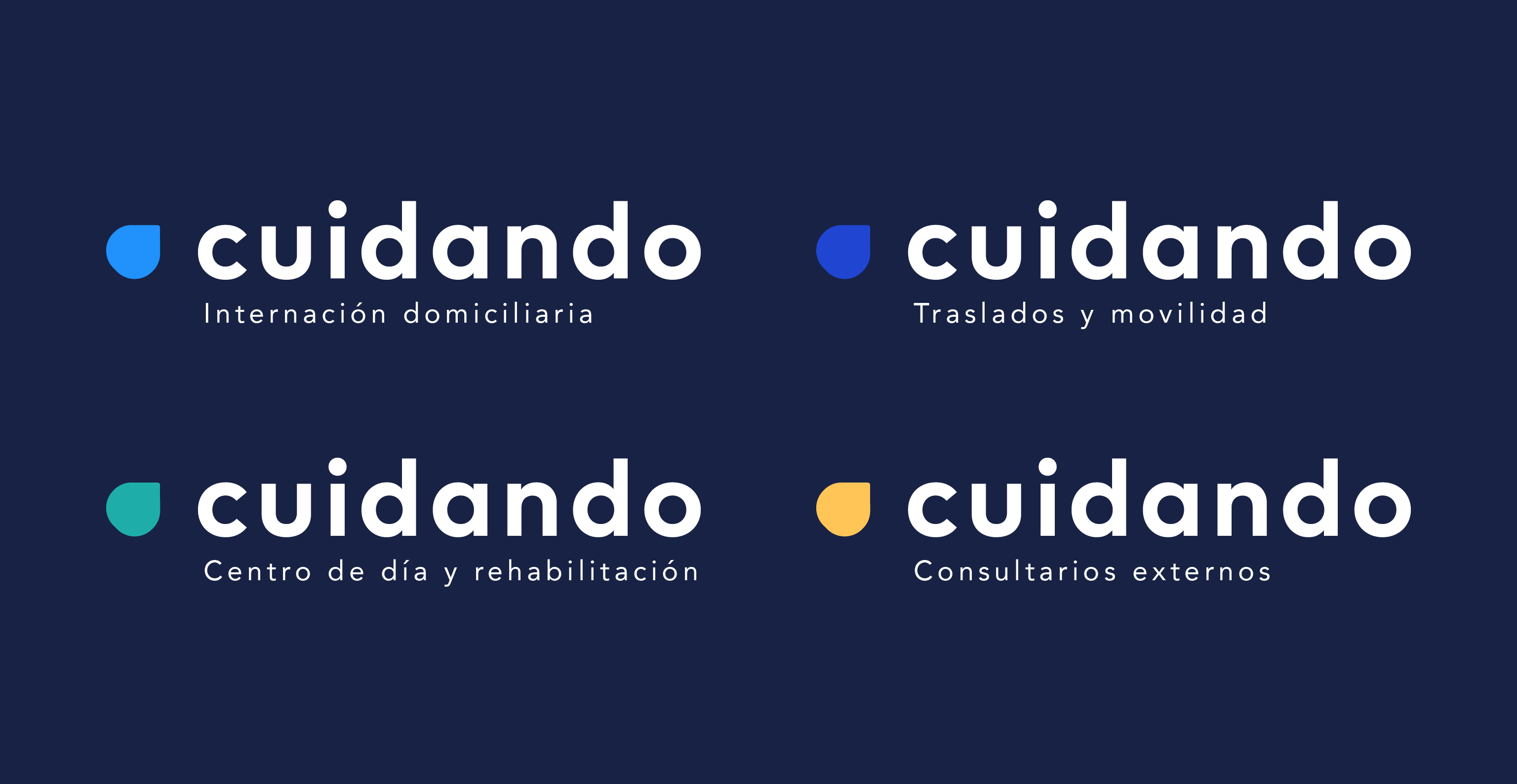
A principle of shape was applied to creat the sub brands: only one segment of the mother logo was used to build them. Reinforcing the idea of "being part" of this global brand: services that are offered by CUIDANDO.
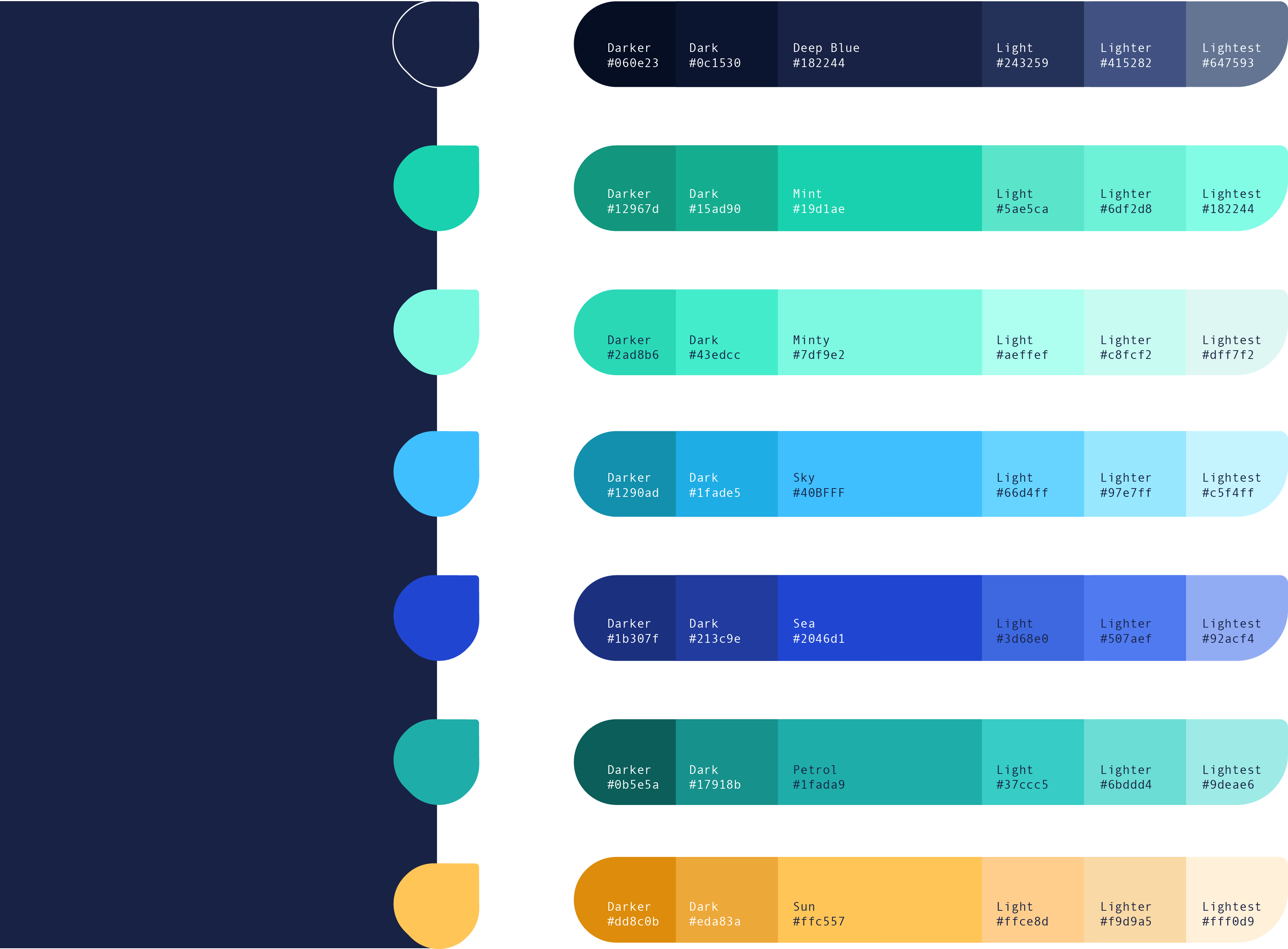
color palette.-
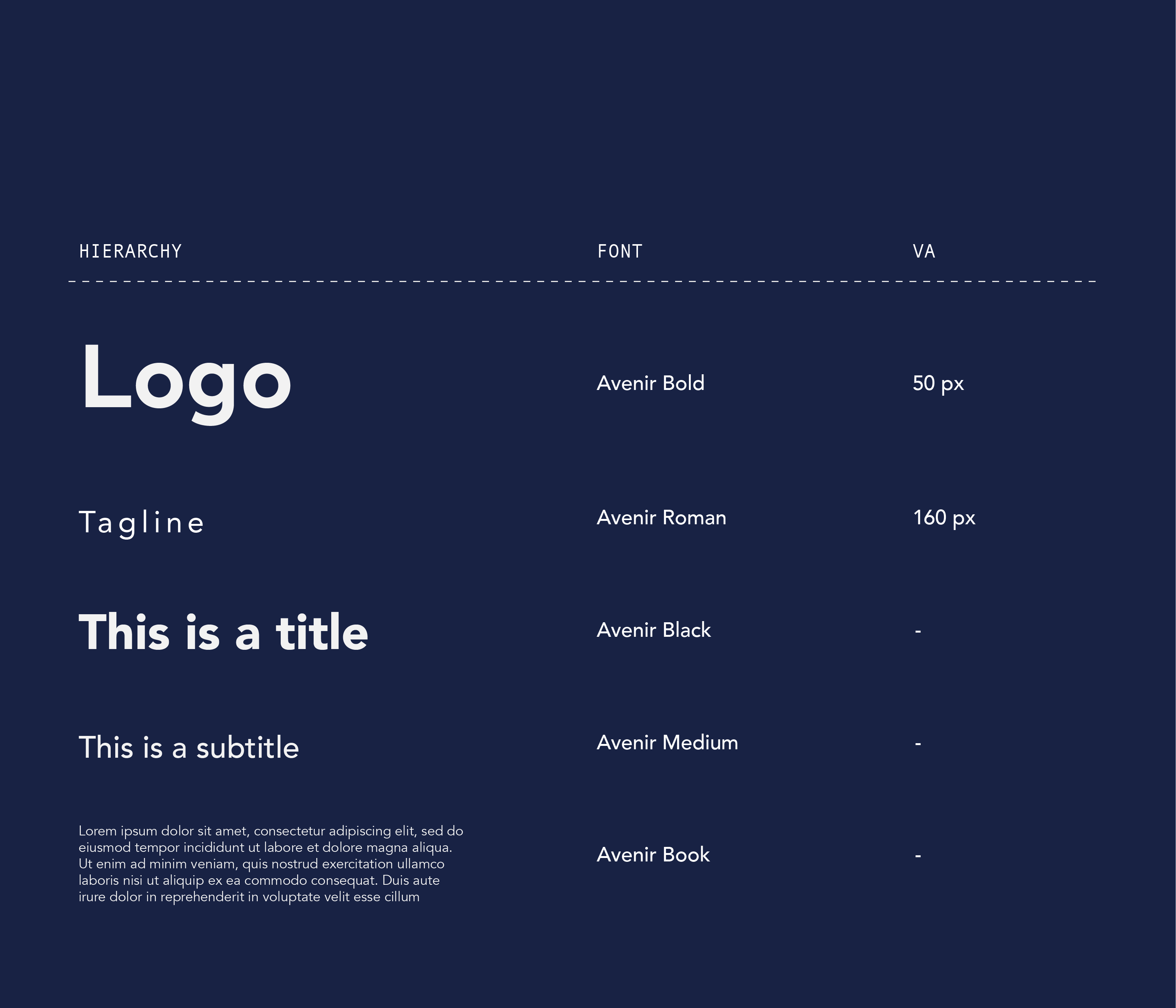
typo graphy.-
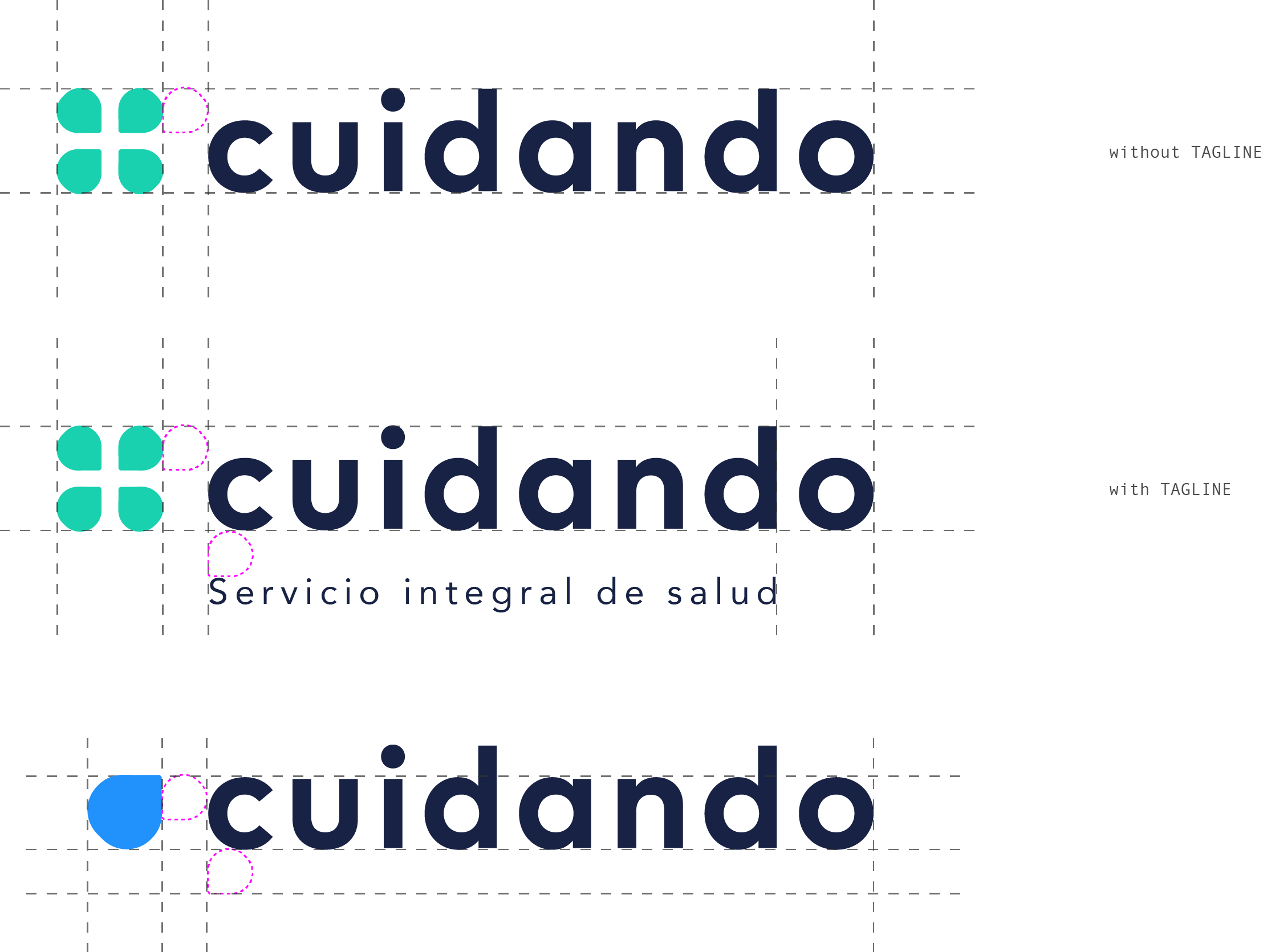
the aligments.-
patterns & graphics.-

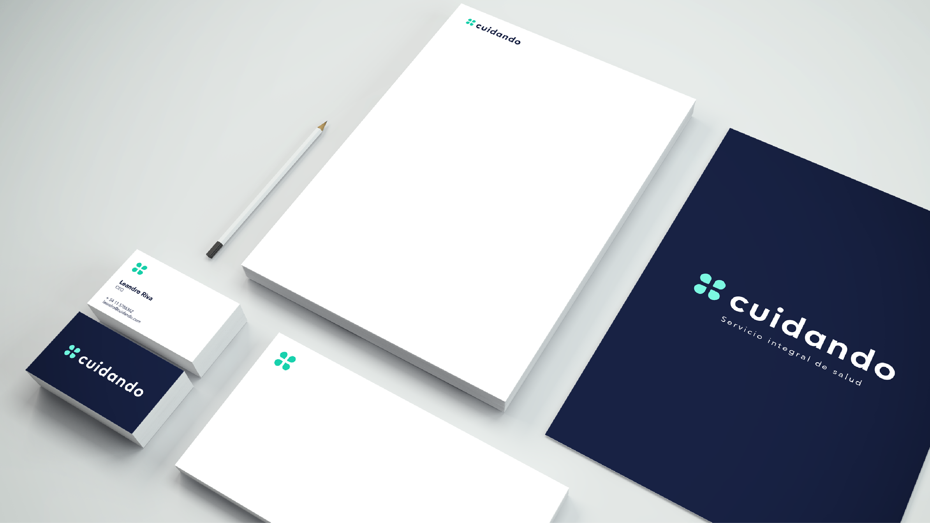
institutional stationery.-
